Citrus Mod — A Wallpaper Design

This week’s Spoonflower design contest is to create a Mod wallpaper design, using only 3 colors (plus black or white optional).   When I was a teen, I had one wall of my bedroom papered with an op art design (much like this one by Alberto Biasi), and though I’m not sure it fits in the Modernist Subculture, I decided to go with an op art inspiration for my design.

I started mod-grid
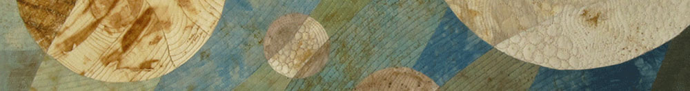
by creating a simple grid of circles.  Then, using the Adobe Illustrator distort options, I played with different options.

Continue reading

Snapshots from a Geek Convention

Spoonflower and Robert Kaufman Fabrics are sponsoring a fabric design contest with the theme being “Geek Chic”.  As a chemical engineer in a previous life, I have a lot of practical experience with geeky things, so I had tons of design ideas to start with.

I thought I’d do something with chemical symbols, but I couldn’t come up with anything that seemed like an interesting design.  I drew a number of geeky accoutrements, including the ties, test tube, sneaker and glasses below.

geek-components

Continue reading

Sailing Notan Style — And the Evolution of a Design

Spoonflower’s weekly design contest theme is “Sailing” and I immediately knew I wanted to use the Notan design I wrote about in this post.

That design used 4 different sail boat-inspired patterns (on the left below), combined Nolan-style into the 16 blocks on the right.

Continue reading

A Dozen Eggs — Painted in a 12-Step Color Wheel

Another week, another Spoonflower fabric design contest.  The theme for this contest is Painted Eggs.

I thought I’d create a bunch of 3-dimensional eggs and ‘paint’ them with some of my other fabric designs.

First, here’s how I created a 3d egg in Adobe Illustrator (version CS5).

  1. Draw an ellipse with the Ellipse Tool (see photo below)
  2. Using the Direct Selection Tool, edit the points of the ellipse to make it egg-shaped
  3. Delete the points on the left side of the ellipse
  4. Use the command Effect ==> 3D ==> Revolve to create the 3-dimentional egg

eggs-3d-egg

Continue reading

Geckos — and Using Clipping Masks in Illustrator

Another week, another Spoonflower fabric design contest.  The theme for this contest is Australian Animals.  So many great options it was hard to pick — kangaroos, wombats, koala bears, emu, platypus, Tasmanian devils…  I googled Australian art and was inspired by the Aboriginal dot paintings.  I thought I’d try a modern take on the dot paintings using kangaroos and geckos.

I’ll go through the technique I used in Adobe Illustrator to create the multicolored animals. gecko-outlines

I started by drawing outlines of a gecko and a kangaroo.  I wanted to keep the outlines pretty simple since there would be a lot of detail inside each animal.

Continue reading

Turtle Tee

Another week, another Spoonflower design contest.  This one is in partnership with the publishers of the series of books called One-Yard Wonders — sewing books with projects you can make with one yard of fabric.  They’re putting together a new book aimed at projects to make for children.  The contest was to design a girl’s tee shirt with the theme “Under the Sea”, and the winning design will be in the new book.  The pattern for the tee shirt was provided.

With Under the Sea as the theme, I immediately though about doing a version of a Hawaiian shirt, using the turtles that I’ve used in a quilt design and in a chevron pattern for another contest. Continue reading

Dancing Matisse

For this week’s fabric design contest Spoonflower partnered with the Nasher Museum of Art at Duke University with the theme of designing a textile that would look at home in a Matisse painting.  They included these examples as inspiration.

I’ve always like Matisse’s cutouts and thought I’d try something in that style.  This web site about Matisse has a great overview of his cutouts, and this is what the National Gallery of Art says about the cutouts:

During the last fifteen years of his life, Henri Matisse developed his final artistic triumph by “cutting into color.” The drama, scale, and innovation of Matisse’s rare and fragile papiers coupes (paper cutouts) remain without precedent or parallel. His technique involved the freehand cutting of colored papers into beautiful shapes, which he then pinned loosely to the white studio walls, later adjusting, recutting, combining, and recombining them to his satisfaction. The result created an environment that transcended the boundaries of conventional painting, drawing, and sculpture. Continue reading

Creating the Quilt Top for “Urban Sunset”

In this earlier post I talked about creating the fabric I used in my quilt Urban Sunset.  My original plan was to use the fabric as-is and create several whole cloth quilts.  However, the more I looked at the printed fabrics (shown below), the more I thought I’d need to cut them up.

I wanted this fabric to be the majority of the quilt, and I decided to use circles since I was looking for an abstract sunset over a city.  Continue reading

Pointy Pink Plaid and Illustrator CS6’s New Pattern Function

I’ve been learning to use Adobe Illustrator to create repeating designs for fabric (here’s an example, and another one).  There’s a new version of Illustrator (CS6) which has a new feature allowing you to easily create repeat patterns.  I’ve been wanting to try it, and as luck would have it, Spoonflower.com announced a contest to create an Arrow-themed fabric design using the new version of Illustrator.  Perfect excuse to try it out, and I learned some important things about how the pattern function works in Illustrator.  (You can see my final design here and vote for your favorites in the contest here.) Continue reading

Creating the Fabric Designs for “Urban Sunset”

When I created this fabric design for a contest at Spoonflower, I knew I wanted to expand on the idea and design some fabric to make a quilt.  In an earlier post, I talked about my initial efforts.

I created the designs in Photoshop, using a custom brush that I’d made from a photograph of bricks.  I used a limited color palette, and used multiple layers in Photoshop to keep each of the colors in its own layer.  I did this so I’d be able to rearrange the order of the layers to get different effects with the colors.  I also used more than one layer for each of the colors, again to be able to control the depth of the colors. Continue reading