Making a Repeat Pattern Look Less Boxy – Photoshop Elements

If you’re designing a repeat pattern in Photoshop Elements, there’s an easy way to make it look less boxy.  The trick is to have design elements which overlap the edges of the tile.

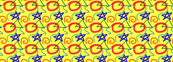
I started with this simple tile.  Each of the design elements is in its own layer in Photoshop.  The tile creates this repeat pattern — there’s clear space between the tiles.

Since each element is in its own layer, I can use the offset command (from the menu:  Filter –>Other –> Offset) to independently move each element.  You can play around with the level of offset to move any element so that it wraps around the tile horizontally, vertically or both.  When you input an amount of offset, a positive number will move the element right or down, and a negative number will move it left or up.  The big benefit of using the offset command is that you can draw/edit an individual design element in its entirety, and then later split it up across the edges of the tile.

Here’s a quick update to the original tile where I moved some of the elements (and also changed the size of some elements).  And here’s the resulting repeat which looks less boxy.

A couple things to keep in mind when using this.  The offset command shifts the entire layer in Photoshop Elements, so it works best if your overall design is in multiple layers which you can shift independently.  Any editing you want to do to your design is much easier to do before using the offset command.  If you want to edit a design after offsetting it, you will usually need to undo the offset before making the edits.

Design is a plan for arranging elements in such a way as best to accomplish a particular purpose — Charles Eames

How to Create A Half-Drop Repeat in Photoshop Elements

In the last two tutorials I showed how to make a seamless repeating pattern in Photoshop Elements.  In this one I’ll show a quick way to make half-drop repeats.  Half-drop repeats add a diagonal line to any pattern, such as the polka dots shown below.

1.  For this repeat to work, you really need a solid color in the background, and you don’t want parts of the image touching an edge.  I’ll start with this basic tile.  Its size is 200 pixels by 200 pixels.

2.  To create the half-drop, we need to add a duplicate tile and then offset it.  So, the first step is to double the width of the ‘canvas’.  This is done from the menu: Image –>Resize –>Canvas size, and then the box shown below pops up.  In the “new size” section, if you set the measurement to ‘percent’ (circled in yellow), then make the width 200 percent.  Alternatively, you can set the measure to ‘pixels’ and set the width to twice as wide as the current size.  In the “anchor”area (yellow arrow), click so that the box looks like that shown below.  This will put the original tile on the left side of your new canvas.

This is what the new canvas looks like in Photoshop.

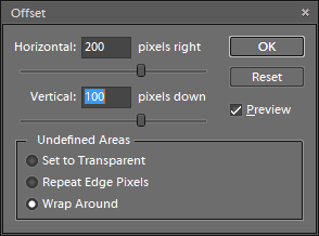
3.  Next, duplicate the layer (from the menu:  Layer –> Duplicate Layer), and then offset this new layer.  From the menu:  Filter –> Other –> Offset.  For the horizontal offset, enter the full width of your original tile (200 pixels for my tile).  For the vertical offset, enter half of the original height of your tile (100 pixels in my example).  Shown below is the Offset dialog box and then the resulting tile.

4.  From this, you can define your pattern and create the repeat (see Tutorial 1, step 6 for directions).  This is the resulting repeat.

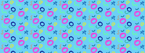
5.  One of the fun things you can do is add designs to the tile created in step 3.  Here I’ve drawn in some additional elements.  When I put this tile into a repeat, the new elements will repeat in a straight repeat while the original elements are in a half-drop repeat (compare the repeat of the blue star to the pink circle).  The repeat is shown below.

Also, with this method, you aren’t limited to creating half-drop repeats.  In step #3 you can specify the vertical offset to be any portion of the vertical size…1/3, 1/4, etc.

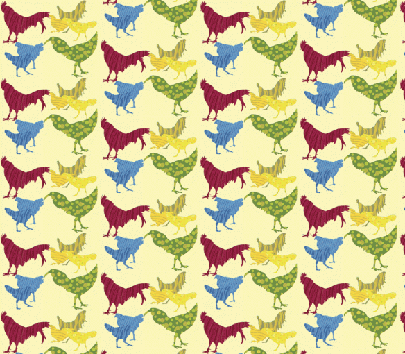
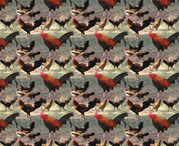
Here’s an example where I recently used a half-drop repeat.  Starting with the crazy Kauai rooster photos from the previous post, I removed the background and hand colored the birds in funky colors.  I call this Kauai Breakfast because it reminds me of breakfast on the beach in Kauai, surrounded by roosters and hens.

How to Create a Seamless Repeat in Photoshop Elements – Part 2

In part 1 I showed how to create a seamless repeat by editing the edges of a tile so that they line up properly when repeated.  There’s another useful way to disguise the edges, and that’s to add new images that go across the edges of the old tile.

1.  Here’s a simple example of this.  I’ll start with the tile below.

2.  Next is to”cut” the tile in half both horizontally and vertically and “paste” it back together.  This is done in Photoshop Elements using the Filter –>Other –> Offset command.  (See the previous post, step 3 for details of how to do this.)  Here’s the result.

3.  I could use the techniques from Part 1 of this tutorial to get the orange lines to meet at the edges so that the repeat would be seamless.  Alternatively, I could just cover up the orange lines with something that goes across the edges.  Here I drew a square to cover up the lines.

4.  Here’s what the two tiles look like in repeat.

Both techniques — fixing the edges and covering the edges — can be use to create a richer repeat pattern.  I’ll show this with the rooster image I created in Part 1 of the tutorial.  Here’s the repeat pattern after the edges were fixed.  The repeat is seamless, but there’s a lot of ‘blank’ background in the pattern.  I’ll fill this in with rooster and hen images from other photos.

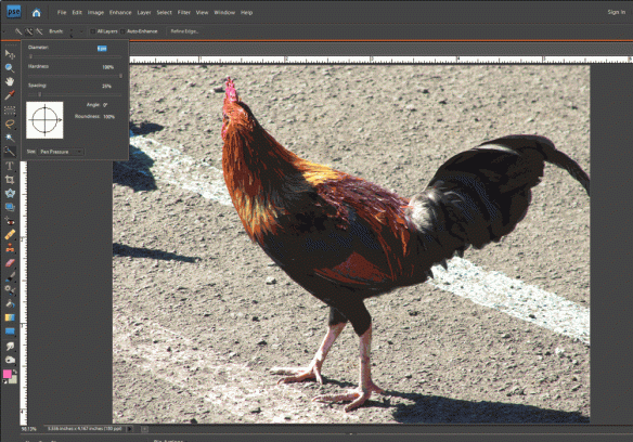
1.  Start by opening another photo with an image you want to add to the pattern.  Here’s a second rooster photo, and I’m going to use the Quick Selection Tool to select only the rooster and not the background.

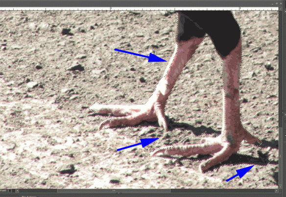
2.  After quickly selecting the rooster, here’s a screen shot where the dotted lines show the rough selection.  As highlighted by the purple arrows, there are some areas that need to be refined.

3.  Refine your selection until only the object you want to copy is selected.  The way to do this with the quick selection tool is to use the “Add to Selection”  and “Subtract from Selection” tools to nudge the selection line as needed (circled on the menu pictured to the right).  It can also be helpful to decrease the brush size when you’re trying to make fine adjustments to the selection.

4.  Once your selection is good, copy it to the clipboard using the Edit –>Copy menu command.

5.  Go to the file that has your original tile and use the Edit –>Paste command.  This will put your copied image into your file in its own layer, which is important so that you can move it around and change its size without changing the original tile.  Here’s a picture of the new rooster copied into the original image.

This would create the repeat pattern shown below.  Note how the second rooster image helps disguise the edges of the repeat tile.  (See Tutorial Part 1, step 6 for details of creating the repeat.)

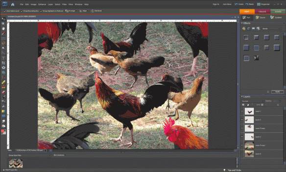
6.  If you want to add more images, repeat steps 1 through 5.  Move the new images around to get an arrangement you like.  Here’s a version with 4 added images of roosters and hens.

And here it is in repeat.  As Ludwig Mies van der Rohe said, sometimes less is more.

How to Create a Seamless Repeat in Photoshop Elements – Part 1

A key step in fabric design is being able to create a seamless repeat.  In this tutorial I’ll walk through a method to create a seamless repeat using Photoshop Elements (the steps are quite similar if you’re using Photoshop).

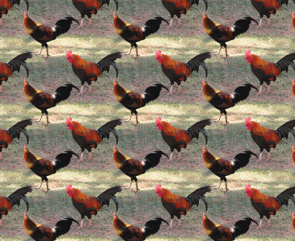
I started with this photo of a rooster (taken on a recent trip to Hawaii).  Note how the background is different in each of the 4 corners — this is what needs to be fixed to create the seamless repeat.  The photo on the right shows the photo in repeat, with the edges very distinct from one tile to the next.
1.  Open your file in Photoshop Elements.  Crop the image and make any adjustments you’d like to the photo.  The photo will be one tile of your repeat pattern.  It’s good for peace of mind to always create a duplicate layer just in case you mess up the photo too much and want to start over.

2.  Note the size of your image  in pixels (Image –>Resize –>Image Size).  For my photo, the image size is 1000 pixels by 750 pixels.

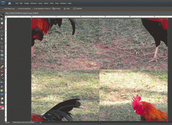
3.  In this step, we’ll “cut” the photo in half both horizontally and vertically.  This will show us where the edges and corners are mismatched and need fixing.  From the menu, choose Filter–>Other–>Offset.  In the pop-up box, divide the width of your image, in pixels, by 2 and type the number in the Horizontal offset box.  Then divide your image’s height by 2 and type the number in the Vertical offset box.

The result shows the photo “cut” up and pasted back together, and there are two clear lines through the middle vertically and horizontally where the photo doesn’t blend seamlessly.

4.  In this step we’ll fix these edges.  There are several different tools in Photoshop Elements you can use to make these edits, depending on your photo and your preferences.  There’s the clone stamp tool, smudge tool, and paint brush tool.  I used the healing brush tool.  Using a series of small fixes, I blended the two sides of each edge to remove the harsh transition.

In this photo, the edges all occur in the photo’s background, so there aren’t any really distinct features.  If you’re working with an image where there are distinct lines across the edges, these need to be fixed carefully so that the repeat ends up seamless.  Here’s the photo (or tile)  after all the edges were cleaned up.

6.  At this point, if you’re done with your image, or if you just want to see how it looks in a repeat, the next step is to define the repeat pattern. Do this from the menu:  Edit–>Define Pattern, and save it with any name you’d like.  Then, create a new blank file in Photoshop Elements.  Make sure it’s large enough to show at least 2 tiles both horizontally and vertically.  From the menu, choose Edit–>Fill Layer.  In the pop-up (shown below on the right) in the Contents section, choose to use Pattern from the drop-down list, and then select your new pattern from the Custom Pattern list, then click OK.

This tile creates the following repeat pattern, and the tile edges are pretty much gone.

My First Entry in a Fabric Design Contest

Each week Spoonflower has a fabric design contest, using a different theme.  Anyone can submit designs and then people vote for their favorites.  It seems like a great way to get some exposure and be creative in the process.  So, this week, I entered for the first time.  The theme is Pointillism — creating a design using dots as some of the painters did in branching off from Impressionism.  The painting I remember from childhood is Seurat’s A Sunday on La Grande Jatte.

Here’s my entry Coneflowers.  You can see all the entries (and vote for your favorites) here.

Two New Small Quilts for Alzheimer’s Art Quilt Initiative

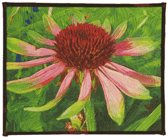
I just completed two more small quilts for donation to the Alzheimer’s Art Quilt Initiative — a great charity that I strongly support since my parents both suffered from Alzheimer’s.

My mother was an avid gardener, a writer of gardening books and an award-winning photographer. While I didn’t inherit her gardening talents, I did start taking photographs at a young age.  Both quilts are based on photos that I took of flowers in my back yard.  I edited the photos to remove some of the detail, then I had them printed on fabric.

Daylily is about 8 by 6 inches. 

Coneflower is about 10.5 by 8.5 inches.  I really like this flower because it’s a bit different with its yellow-green tipped petals.

One More Fabric Comparison

Someone reminded me today of another fabric “experiment” that I did–one that looked at the affect of sunlight on the fabric.  I again used the three samples — one an inkjet print on glossy photo paper, one a Spoonflower sample, and one printed on fabric using my Epson printer.  These are the samples before exposure to the sun.

I taped three swatches to a sunny south-facing window for 4 months.  Here are the results.  (Note that the Spoonflower swatch below is different from the swatch above, but the colors are very similar.  The other two swatches are the same ones in both photos.)

The Spoonflower fabric held up quite well to the sun exposure, but the ink jet prints faded significantly.

Echinacea Fabric – Comparing Designs to Fabric

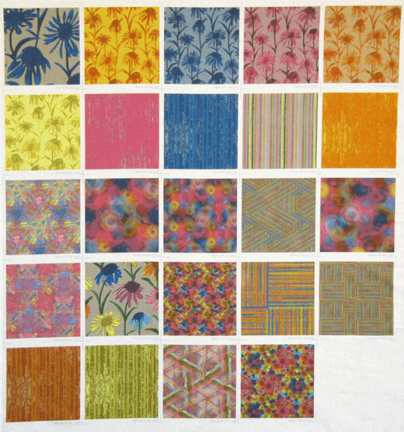
I just received the fabric swatches of each of the designs I made for the Echinacea collection–very exciting!  Up to this point, the designs only existed on my computer monitor, but now I have them in real fabric.  Here’s a photo of the fabric with the 24 swatches (it definitely looks better in person).

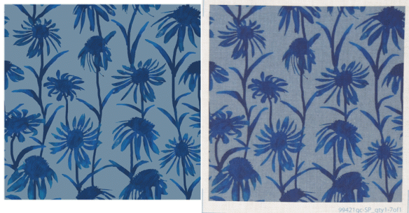
To get an idea of the difference between seeing the design on a computer monitor and the design printed on fabric, here’s a picture that includes the digital design on the left and a photo of the actual fabric on the right.  I tried to get the colors of the photo as close as possible to the actual fabric colors, but the fabric background is a bit bluer than this photo shows.  You can see all the digital designs on my fabric page.

After seeing the fabric, I made a few minor adjustments to some of the designs.  I’m not sure how the blue flowers in the upper left swatch got so gigantic, but I changed the size to an 8 inch by 8 inch repeat — the same repeat size as the other flowers.  I also changed the size of the multi-colored flowers (row 4, second from left) to also be 8 by 8 inches — this swatch shows it at 12 by 12 inches.  I modified the stripe colors in the pink, blue and orange striped fabrics in row 2.  In each of these samples I didn’t think there was quite enough contrast between the stripes.  I think this was mostly an issue of some of the colors being “out of gamut” for the printers that Spoonflower uses — basically the colors I saw on my computer monitor weren’t printed the same way by Spoonflower.  This photo below shows this issue with the orange stripe design.  On the left is the original design with an arrow pointing to some of the bright orange that was out of gamut.  In the middle is the fabric with the arrow pointing to the same part of the fabric, but the orange color is not as vibrant and the contrast between the stripes is too low.  On the right is the design with the corrected colors — the orange is a bit darker now and there’s more contrast.

Sunset Over Wisconsin Quilt

This weekend I wanted to try to make a more improvisational quilt than I’ve been doing lately.  I thought I’d try to use up a lot of the smaller pieces of fabric I had leftover from previous projects.

In particular, I wanted to use of some of the leftovers from A Walk with Sparky, shown here on my design wall.

I started cutting these up and sewing them together with some hand-dyed fabric scraps, just matching colors I liked.  I started arranging them into longer strips on my design wall, but I still wasn’t sure what to do with them.

Still without a real plan, I cut some of the pieces and started sewing them into stips of similar colors, light values at one end, progressing to darker values.  I was still envisioning this as a vertical arrangement.

When I finally turned the strips horizontally, I realized it looked like a sunset over the farm hills of Wisconsin.  I kept the quilting very simple–just echoing some of the curves.  Here’s the finished quilt.

Sunset Over Wisconsin

Winter Cardinal Quilt

I recently completed this small quilt–it’s about 9 inches by 12 inches.  It is a donation quilt for AAQI (as soon as I get around to sending it in).  We have a bird feeder right outside our kitchen window, and at this time of year, the cardinals that come to visit are one of the few bright spots in the yard.  Often we’ll see several male and female cardinals sitting in the pine tree, waiting for their turn at the feeder.

The quilt is made from a single piece of hand-dyed fabric with a piece of rust-dyed cotton/silk for the branch, and then lots of thread.