Sometimes when creating a design (fabric or otherwise) it’s helpful to work with a fixed palette of colors. The inspiration for a color palette can come from anywhere, and I find that photos are often a great source of color palettes. In this post, I’ll show how to quickly create a color palette (called a color table in Photoshop) from a photo. You can then use the color palette to create your own designs.
This post compliments a couple of my previous posts where I talked about how to color-reduce a photo in Photoshop Elements, and then how to generate a Color Table from the color-reduced photo and use the color table to create coordinating designs.
I’ll start with this photo that I took of Delicate Arch in Utah. I used this photo to create a small quilt for the Alzheimer’s Art Quilt initiative, which you can see here.
1. With the image open in Photoshop Elements (or Photoshop), choose the following from the menu: Image –> Mode –> Indexed Color. If your image has more than one layer, Photoshop will ask to flatten the image–click OK. (This is a good spot to remind you to always make a backup copy before modifying your photos.)
2. This opens the Indexed Color menu, shown here. In the Palette drop-down, select Local (Adaptive). Make sure the preview box is checked, and then play around with changing the number of colors. Here you’re trying to extract the ‘appropriate’ number of colors for your palette — you’re not trying to edit your photo. When you’re happy with the colors, click the OK button.
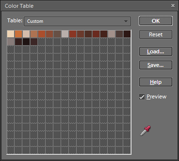
3. The photo is now reduced to the number of colors chosen — 20 in this example. To bring up this color palette, selec t Image –> Mode –> Color Table from the menu. This will open the Color Table window shown here. Click the Save button and give your color table a name. Photoshop saves it as a file with an extension of .ACT.
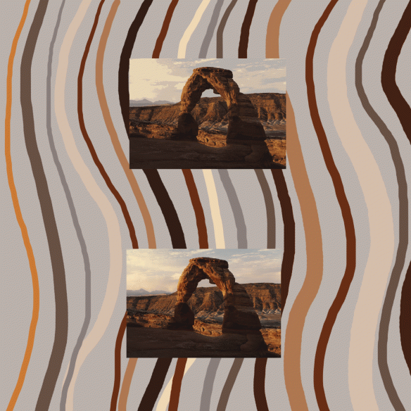
4. Using the steps outlined in this previous post under the heading “Using a Saved Color Table”, I created a stripe design using this color palette. It’s shown below along with the color-reduced photo (on top) and the original photo (on bottom).
You might notice that the color palette is pretty weak on the colors from the sky of the original photo since that’s a small portion of the photo. It’s easy to generate a color palette which emphasizes part of the photo. Use the Marquee tool to select the area of the photo you want to emphasize, and then follow steps 1 through 4 above. The picture below shows the marquee and the color table which results from selecting this portion of the photo. This color table has more of the grays/blues from the sky than the first color table.
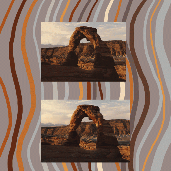
And here’s an example of a stripe design using this second color palette along with the color-reduced photo (on top) and the original photo (on bottom).
I lack the magnificent richness of color that animates nature.
Paul Cezanne


Thanks, this helped me