Fading Memories

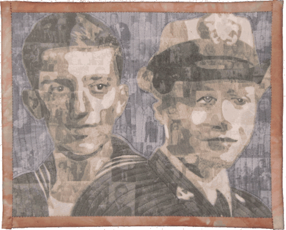
I made Fading Memories last year as a donation quilt for the Alzheimer’s Art Quilt Initiative, which is a non-profit group raising money for Alzheimer’s research (over $520,000 so far!).

My parents both suffered from Alzheimer’s. This quilt portrays them as young adults when they each served in the Navy in World War II.  The fabric in the quilt is made from photos taken over the course of their lives — representing all the memories that faded as the Alzheimer’s progressed.   Using family photos, I created a montage, and then printed the montage in five different values (light to dark) on fabric.  With this fabric, I created the ‘cut out’ portraits of my parents from their Navy portraits.

The back of the quilt shows the photo montage along with a more recent photo of my parents.

Fading Memories – back

This quilt is my post for the Spring 2011 Blogger’s Quilt Festival.

Color Reducing a Design Using Photoshop Elements

In a previous post I talked about why you might want to color reduce a design, even in the age of digital printing.  In this post, I’ll go through the steps to color reduce a photo in Photoshop Elements.  I’ll also note the differences for Photoshop since there are some variations.

The basic process is just a couple of steps:

  • convert the photo to the ‘indexed color’ mode with 256 colors
  • reduce the number of colors to around a couple dozen by picking the main colors from the photo

Steps for Color Reducing a Photo

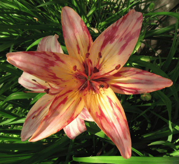
1.  Here’s the photo I’ll start with.  Note that this photo is in RGB color mode.  It’s always a good idea to work on a copy of your image and keep the original image unchanged.
2.  The layer needs to be unlocked.  Often when first opening a file, the layer will be locked (indicated by the padlock icon on the layer–circled here.)  To unlock the layer, click on the padlock icon in the menu (arrow) and the padlock next to the layer will go away.

xxxx

3.  The next step is to convert the photo to what Photoshop calls the Indexed Color mode.  If your file has multiple layers, they will be merged when you convert it to Indexed Color mode.  From the menu, select the command Image–> Mode –> Indexed Color as shown below.  This will bring up the pop-up box outlined in green below.  Make sure the settings are set as follows:
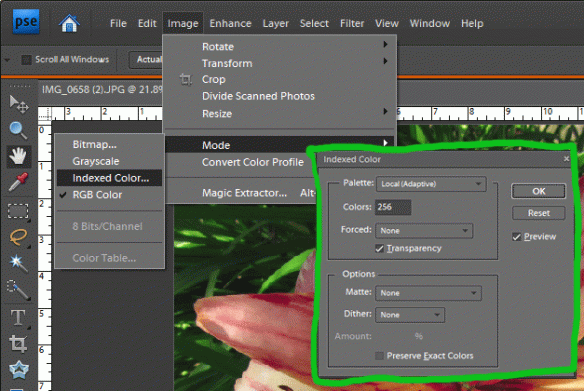
  • Palette–Local Adaptive
  • Colors–256
  • Forced–None
  • Preview–Checked
  • Dither–None

DO NOT CLICK OK.

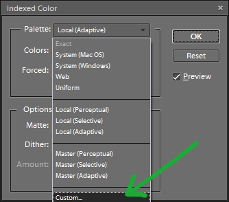
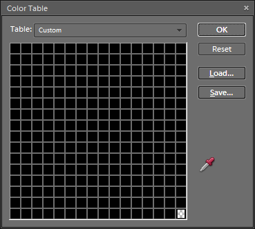
3a.  Without closing the “Indexed Color” pop-up box, click on the Palette drop-down list again and change the selection to Custom (see picture to the right).  Note for Photoshop only:  sometimes the “Custom” option is grayed out.  If this happens, reselect “Local(Adaptive)” and change the number of colors (say to 255) and then change the Palette again to “Custom”.

xx

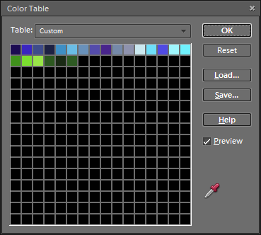
4.  This will open up a color table (shown  to the right) with 256 colors from the photo.  The photo has been reduced to these 256 colors, but we want to reduce the number of colors much further.  Do NOT click OK.

5.  Next is to select all the colors in this color table and change them to black.  To do this, click on the color in the upper left corner of the color table, and drag your mouse down to the lower right corner so that all the color boxes are selected.

5a.  This opens the color picker window shown here.  Select black for the color, either by clicking in the lower left portion of the color window, or by typing 0 (zero) into the R and G and B boxes.  Then click the OK button twice to close the color picker.  Do NOT click OK to close the color table.
xx

6.  Now the Color Table is filled with black squares.  We need to replace some of these black squares with the colors we’ll have in the final color-reduced image.

xx

xx
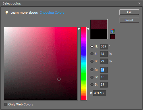
7.  Click on one of the black squares in the color table, and the color picker window opens again.  With the mouse, go the to main photo and click on one of the colors you want to keep.  This color will then be in the color picker window.

xx

xx

7a.  Click OK in the color picker window and the new color will replace the black square in the Color Table.  Do NOT click OK to close the Color Table.

8.  Repeat steps 7 and 7a to select additional colors from the photo.  Using more colors gives a more accurate representation of the photo, but also makes changing colors later more work.

xx

9.  Here is the color table with 22 colors selected from the photo.  When you think you’ve selected enough colors, click OK to close the Color Table.  Since the Preview button was checked in step 3, this will show a preview of your color-reduced photo.  Unfortunately, if you don’t like the results, the only thing to do is select Cancel and start over from the beginning.  If you like the results, click OK and your photo is now color reduced, as shown below.

Note:  In Photoshop Elements (and Photoshop) many image editing functions don’t work if your image is in Indexed Color mode.  To make changes (other than swapping colors which is described below) you should change the image back to RGB color mode.  This is done from the menu:  Image–> Mode–> RGB Color, as shown below.

Swapping Colors in a Color-Reduced Photo

Now for the fun part…changing the colors.

1.  If your file is back in RGB Color mode, first change it to Indexed Color mode:  Image–> Mode–> Indexed Color.  In the pop-up box, make sure the Palette is set to Exact (see picture on right) and click OK.  Using Exact for your palette loads the colors which you picked when color-reducing the photo.

xx

xx

2.  With the image in Indexed Color mode, open the color table:  Image–> Mode–> Color Table, and the color table with your custom colors will pop up.

3.  Make sure the Preview box in the Color Table pop-up is checked.  Click on one of the colors in the Color Table that you’d like to change, and the color picker window opens.  Select the new color and click OK.

4.  With the Preview box checked, you’ll see the changes to your picture as you change the colors (see below).  Repeat step 3, selecting additional colors to change until you’re satisfied with the result.
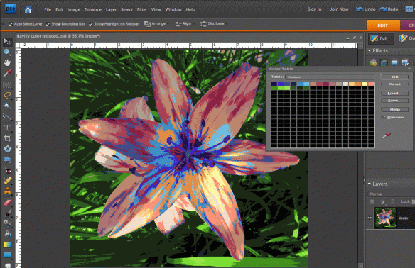
5.  Here is the color table after I’ve changed all the flower colors to blues and purples, but I left the greens unchanged

xx

xx

xx

xx

And here is the Purple Daylily.
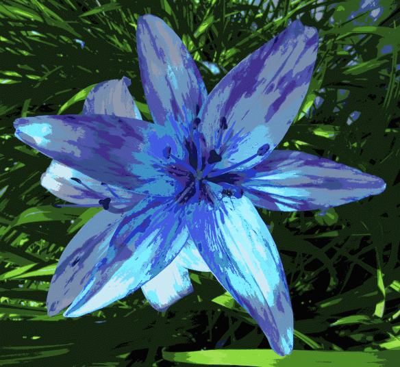
Here’s a comparison of the original photo (left), the color reduced photo and the re-colored photo.

“If you see a tree as blue, then make it blue.”– Paul Gauguin

“Oh, I love red. I”m very loyal to my colors. I love violet.”–Elizabeth Taylor

Color Reducing a Design — What is it and Why Bother?

Most printed commercial fabrics today are made using some form of screen printing technique.  This requires a separate screen for each color which will be printed.  More colors mean more screens and higher manufacturing costs.  To keep costs down, designs may be color reduced to use fewer colors in the final manufacturing set up.

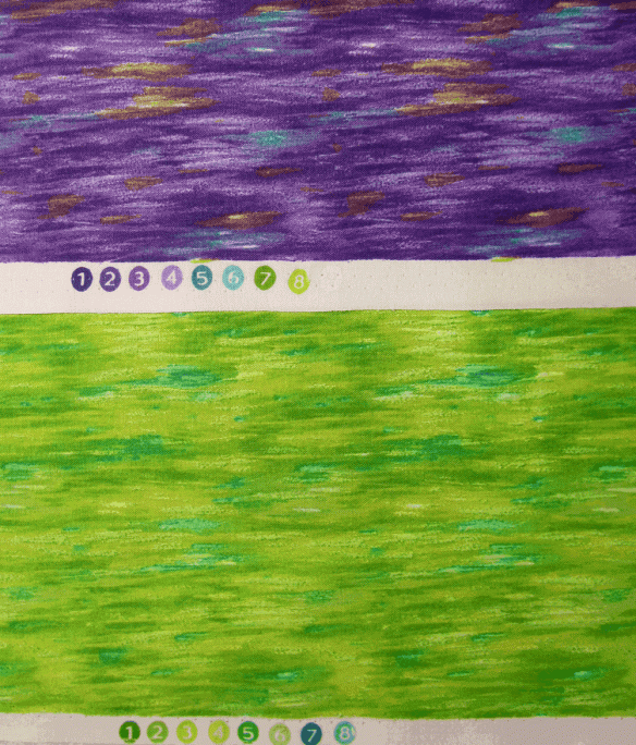
Printed commercial fabrics will often show the colors used in the printing process as numbered circles along the selvage of the fabric.  Shown below are two colorways of the same design from Timeless Treasures.  Each fabric was printed using the same screens, but 8 different colors, and the end results are different, with more contrast in the first fabric.

The design process for a commercial fabric might start with a hand-drawn or hand-painted design which is then scanned into a computer where the design and its repeat are finished.  However, scanning an image is likely to result in thousands of colors–way too many for screen printing.  A big part of the computer side of the design process is to reduce the number of colors to a manageable number–often less than a dozen–without sacrificing the quality of the original artwork.  Once the “color reduction” is done, it’s a simple matter  to change the colors to generate different colorways of the same design.

Digital printing technology allows anyone to print on fabric with virtually an unlimited number of colors.  For many situations, there’s absolutely no need to color reduce a design before printing it with either your own inkjet printer or through one of the on-demand printing services  (see here for some places to print your fabric).

Even though digital printers print with a huge range of colors, there are still some situations when color reducing a design is useful.

Color matching–When printing fabric on an inkjet printer, the colors you see on your computer screen are not always the colors you get on your fabric out of the printer.  This can be frustrating and expensive.

A way to minimize this issue is to create your design using colors which you know how they will print on fabric.  Most of the on-demand printing services offer color swatches and the corresponding digital file so you can see the printed color on fabric compared to the color on your computer screen–here’s an example of Spoonflower’s color guide.  If you’re printing on your own inkjet, you can create and print your own color guide.  When you use colors in your design from your color guide, you can be confident how the colors will print on fabric.

When you start your design with a photo or a scanned image, you might have colors in your design that you aren’t sure how they will look printed on fabric.  Using Photoshop Elements (or other digital editing tools) you can replace colors in the design with known colors from your color guide.  However a photo or scanned image might have thousands of colors, so to make color replacement manageable, the design first needs to be color reduced to a much smaller number of colors.

Colorways and color palettesTwo more reasons to color reduce a design are to create the design in different colorways or to create designs using a common color palette.  I used these techniques in creating the designs for my Echinacea collection.

I started with the ‘focus fabric’ shown below.  This design was color reduced to 64 colors.

Using Photoshop, I selected from the 64 colors in the design to create separate color palettes of blues, pinks and oranges.  Then I replaced all the colors in the design with the blues to get the blue version of the coneflowers (below).  Using this version of the design (now with about 10 colors rather than 64) I replaced the blues with pinks and then with oranges to get the different colorways.

I used the same color palettes to create the stripe fabrics to coordinate with the floral prints.  You can see more fabric designs using these colors here.

In upcoming posts I’ll discuss how to use Photoshop Elements to color reduce a design.  An example is below–the original photo is on the left, the color reduced design is in the middle, and a recolored version is on the right (zoom in to see the differences).

Dorothy:  What kind of a horse is that?  I’ve never seen a horse like that before! 
Cabby:  No, and never will again, I fancy!  There’s only one of him, and he’s it.  He’s the Horse of a Different Color you’ve heard tell about! 
–from the Wizard of Oz

[looking for a certain type of flower]   Blue flower, red thorns. Blue flower, red thorns. Blue flower, red thorns. Man, this would be so much easier if I wasn’t COLOR-BLIND!
–Donkey in Shrek

My Cone Flower Quilt is in the May Auction for AAQI

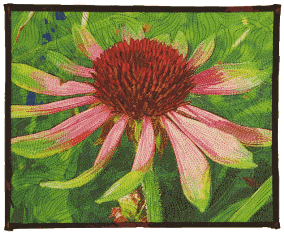
One of my small quilts, Cone Flower, is part of this month’s quilt auction benefiting the Alzheimer’s Art Quilt Initiative.  This non-profit, all volunteer group has raised over $520,000 for Alzheimer’s research since 2006.

Below are some of the other quilts.  You can see all the quilts up for auction (and place your bids) here.

Here’s Cone Flower, my quilt in the auction:

You can see a short video of the new traveling exhibit Alzheimer’s Illustrated:  From Heartbreak to Hope here.