Not Boxed In

The latest design contest at Spoonflower is all about geometrics, and creating the design using only two colors (RGB #a7bb7d and #724b64) plus white.  I like geometrics, so I thought this would be a fun design to work on, though I never would have picked these two colors on my own.

To get started thinking beyond the basic circles and squares, I looked up Geometric Shapes in Wikipedia, and discovered a bunch of fun shapes, like the Bankoff Circle, the Arbelos and the Asteroid…if they covered these in my High School Geometry class, I must have been asleep that day.  Continue reading

Variations on a Fabric

A while ago, Spoonflower had a contest to create a Hawaiian ‘cheater’ quilt design, and I wrote about my design here and about the wall quilt I made from the fabric here.

Here’s the original design, using the turtles and flowers of Kauai.
Continue reading

Painted Daisies, Take 2

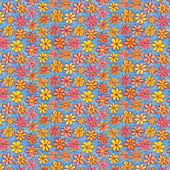
I played around some more with my Painted Daisies design, done for the Fabric8 Contest at Spoonflower.  Here was the previous version.

While I like the colors, the design seems boring.  I decided to try adding lots more layers of daisies to fill in all the spaces.  I made this first attempt by duplicating the layer and moving it–just to see if the idea might work. Continue reading

Painted Daisies, Take 1

Another week, another fabric design challenge…  Spoonflower and Robert Kaufman Fabrics are sponsoring the Fabric8 contest.  The challenge is to create a modern fabric design that evokes the style of pen & ink drawings colored with watercolor paints.  This isn’t my usual style, so I thought it would be a good challenge to tackle to stretch myself.

When I think of modern fabrics, I think of bright colors and bold styles–again, not exactly what I’d picture for pen and ink drawings colored with watercolors.  So, anyway, here’s my interpretation of the theme. Continue reading

Urban Sunset Revisited

In a recent post I showed how I created “Urban Sunset”–a repeat design for a fabric design contest.  I really liked the design and thought I’d try to create a non-repeating design that I could print on fabric and then turn into a whole cloth quilt.  My plan is to create a design that’s about a yard wide so I can have it printed at Spoonflower on a full yard of fabric.

Here’s the ‘brick’ brush I created in Photoshop.  It’s slightly different from my earlier post in that I cleaned up the edges a bit. I used only this brush in all the designs.

x

Continue reading

Fun Daisies Fabric Collection

I entered another of Spoonflower’s weekly fabric contests.  This one called for a one-yard image that included four distinct coordinating fabric designs, including at least one stripe pattern and one dot pattern. I’m not sure why I enter these contests…but it’s fun working on the designs and I’m learning a lot about Photoshop and Illustrator and repeat pattern design in the process.

I thought I’d try to use the ten colors in the Pantone Spring 2012 fashion color trends as my palette, since it’s trendy and these are not colors I’d normally pick (especially Sweet Lilac).  A floral theme seemed to fit well with the spring colors, so I started gathering some of my photos of daisy-like flowers.  Continue reading

Fabric Design — Gockoo’s Apple Crisp

One of Spoonflower’s recent weekly fabric design contests was to design a fabric using a recipe as part of the design.  I’m not much of a cook (my husband does most of the cooking, though I’ve mastered the NY Times No-Knead Bread), so I don’t have any go-to recipes.

As I thought about this contest, I remembered my grandmother’s hand-written cookbook from the 1930’s.  Gockoo (as we called her) wrote her recipes in a journal and added ones she found in newspapers or magazines, or ones she got from friends.  I found her recipe for apple crisp pudding and thought it would make a nice nostalgic print, especially since there were only a handful of ingredients in the recipe. Continue reading

Kites — Another Notan Design

Spoonflower, my favorite place for printing custom fabrics, has a fabric design contest each week.  Sometimes I enter it since it’s a fun way to try out new designs and practice my design skills.  This week’s contest is to create a small repeating design with the theme of Kites.  I knew I’d love to experiment with some more Notan-style designs for this contest.

I started with four simple kite drawings that I did in Illustrator.  I wanted the shapes to be fairly simple with each main kite shape touching two edges of its square.

Here’s the first repeat, in blue and black.  It was obvious that the tails of the kites needed more work. Continue reading