I entered another of Spoonflower’s weekly fabric contests. This one called for a one-yard image that included four distinct coordinating fabric designs, including at least one stripe pattern and one dot pattern. I’m not sure why I enter these contests…but it’s fun working on the designs and I’m learning a lot about Photoshop and Illustrator and repeat pattern design in the process.
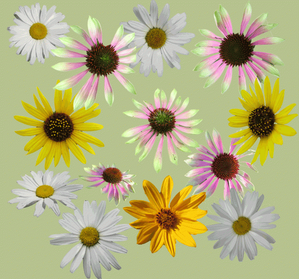
I thought I’d try to use the ten colors in the Pantone Spring 2012 fashion color trends as my palette, since it’s trendy and these are not colors I’d normally pick (especially Sweet Lilac). A floral theme seemed to fit well with the spring colors, so I started gathering some of my photos of daisy-like flowers. Here are some of the photos I used (on a Margarita-colored background).
x
 Before I started putting together fabric designs, I worked with the individual flower photos to get them ready for the designs. Shown to the right (on a Starfish background) is the evolution of one of the photos.
The original photo, with its background removed, is on the top.
x
In the second photo, I’ve cleaned up the flower. This included adding missing petals where needed, repairing spots on the flowers, and removing more of the extraneous background. (These adjustments were done in Photoshop.)
x
x
In the third step I copied the photo into Illustrator and reduced the number of colors in the photo to about 6 or 8 colors. In this previous post I went into some detail about how I did this. (This can also be done in Photoshop, though I think it’s a bit more awkward–I talked about it here.) In Illustrator I also deleted any remaining bits of background. For some of the flowers, I added more detail using the blob brush tool and one of the colors in the flower. For example, in this flower I added more pink dots in the center. The result of this step is a flower that I can easily recolor.
The fourth version shows the flower recolored using two of the Pantone colors–Solar Power and Tangerine Tango, which, by the way, is the Pantone Color of the Year for 2012.
x
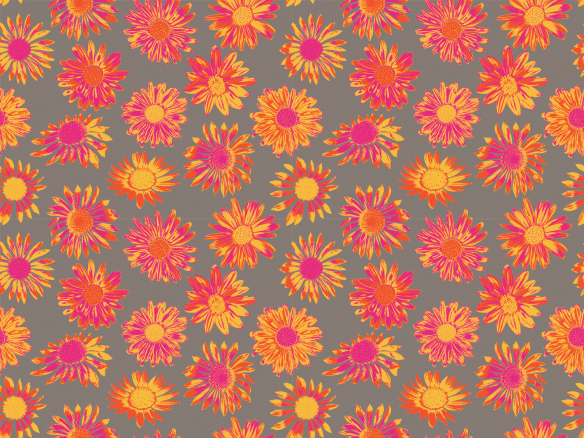
Once I had color-reduced a bunch of flowers I could start on the designs. I wanted a large print for the collection, with the flowers about 4 inches across, so I started coloring the flowers in different color combinations. After I put several together, it seemed obvious that using all the colors wasn’t going to work, and I’d need to limit the number of colors in the flowers (multicolored flowers, with Driftwood for the background).
I tried limiting the flowers to Solar Power, Tangerine Tango and Cabaret and liked the results. Here’s the final version of the large print:
x
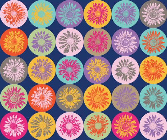
One of the designs for the contest had to be a dot pattern. I thought this would be a good place to use all ten colors in the Pantone spring palette. In Illustrator I made a bunch of 1 inch circles in each of the 10 colors, and I added single-color daisies inside each circle. Once I’d eliminated the bad color combinations, I arranged them in a regular pattern with each circle touching the next circle. Below is the pattern on a Sodalite Blue background.
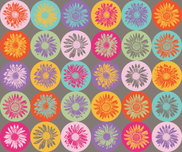
Although I quite like the blue background, after I put all the designs together I thought it would be more cohesive if this had the same Driftwood background as two of the other patterns. Below is the final version of Daisy Dots. In the end, I didn’t use the Sodalite Blue in any of the four prints.
x
One of the designs had to be a stripe. Using the same small daisies as in the dots pattern, I arranged them into stripes and played around with different color variations. One of the great things about Illustrator is that it’s so quick to change colors. Some of the variations I came up with are below.
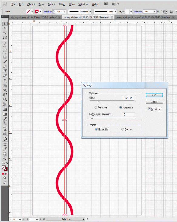
I thought I’d also try some stripes without the flowers. Rather than just straight stripes, I made them wavy by using the Effect==> Distort and Transform==> Zig Zag command in Illustrator. This brings up the dialogue box shown below.
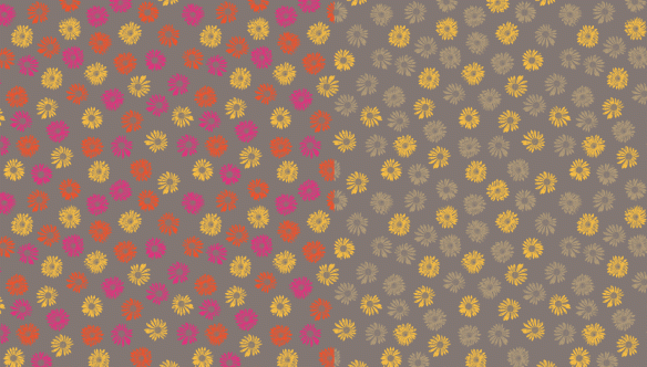
I did a couple of quick versions of the wavy stripes, one on the lighter Starfish background (left side) and one on the Driftwood background.
At this point, the contest deadline was looming and I didn’t have much time to finish a fourth design. I decided to use the wavy stripes for my stripe design and then use the small daisies and make an all-over ditsy print. Below are two different versions–the daisies are about a half-inch wide.
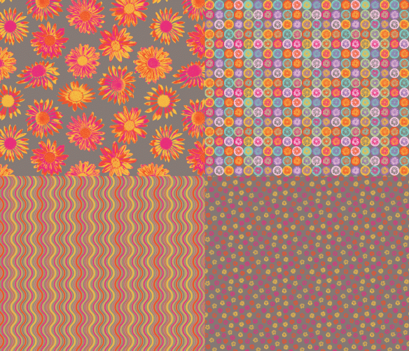
So, with time running out, here are the four designs I submitted for the contest.
If I’d had more time, I’m sure I would have made more changes….
x
Sunshine, daisies, butter mellow, Turn this stupid, fat rat yellow.–Ronald Weasley in Harry Potter and the Sorcerer’s Stone



wow- I always learn so much from your blog posts!