In my previous post I showed how I got to the fully pieced top for Moonstruck. Here it is.

x
In my previous post I showed how I selected all the fabrics for Moonstruck. Here they are all pinned to the pattern template on my design wall.

The next step is to sew it all together. Continue reading
In my previous post I showed how I developed the final quilt pattern (below), including the order of piecing, for Moonstruck. On the quilt pattern, I numbered each piece and added registration marks along the seams so that I’ll be able to line up the pieces when I sew them.

x
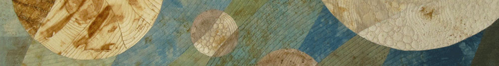
In my previous post I showed how I developed the design (below) for Moonstruck.

With the overall design done, I next had to figure out how I could make this into a quilt top. My plan was to use the rust-dyed fabric in the smaller circles (the Moons). For the larger arcs, I planned to use an alternating green and blue gradation of over-dyed rust fabric–from light in the upper left to dark in the lower right. The Moons were the focus and the arcs the background. Continue reading
My quilt Moonstruck recently returned home after a long trip with the Rust-Tex Collection, including its debut at the Spring International Quilt Festival in Chicago (2010) and a visit to England for the Festival of Quilts (photo from the show below, Moonstruck is the blue and green one).

x
I began working on this small quilt a few years ago, and it took me well over a year to get it to the point it’s at now.
I started with a bunch of small pieces of leftover fabric–some were from other quilts but most were from experiments playing with dye stenciling, monoprinting and discharging. I cut the fabric into 4 inch squares and started arranging them on my design wall.
Here’s one arrangement of the squares.

I entered another of Spoonflower’s weekly fabric contests. This one called for a one-yard image that included four distinct coordinating fabric designs, including at least one stripe pattern and one dot pattern. I’m not sure why I enter these contests…but it’s fun working on the designs and I’m learning a lot about Photoshop and Illustrator and repeat pattern design in the process.
I thought I’d try to use the ten colors in the Pantone Spring 2012 fashion color trends as my palette, since it’s trendy and these are not colors I’d normally pick (especially Sweet Lilac). A floral theme seemed to fit well with the spring colors, so I started gathering some of my photos of daisy-like flowers. Continue reading
One of Spoonflower’s recent weekly fabric design contests was to design a fabric using a recipe as part of the design. I’m not much of a cook (my husband does most of the cooking, though I’ve mastered the NY Times No-Knead Bread), so I don’t have any go-to recipes.
As I thought about this contest, I remembered my grandmother’s hand-written cookbook from the 1930’s. Gockoo (as we called her) wrote her recipes in a journal and added ones she found in newspapers or magazines, or ones she got from friends. I found her recipe for apple crisp pudding and thought it would make a nice nostalgic print, especially since there were only a handful of ingredients in the recipe. Continue reading
The December challenge for the Fast Friday Fabric Challenge group was to experiment in contrast and color and use strong value contrast in a dramatic way. In art, chiaroscuro refers to the use of light and dark, usually to add depth and volume to a painting. Rembrandt often used the technique, such as in his Self Portrait as the Apostle St. Paul.
For my quilt I wanted to start with a photograph, and I found this one of a water lily that I took last summer at the Como Park Zoo & Conservatory in St. Paul, Minnesota.

We had another amazing year in 2011, so much so that we couldn’t contain it all in a simple holiday card. So, here’s our look back at 2011…
In the spring we took a little road trip and dropped off a few guys who had some business to take care of.

T

