The December challenge for the Fast Friday Fabric Challenge group was to experiment in contrast and color and use strong value contrast in a dramatic way. In art, chiaroscuro refers to the use of light and dark, usually to add depth and volume to a painting. Rembrandt often used the technique, such as in his Self Portrait as the Apostle St. Paul.
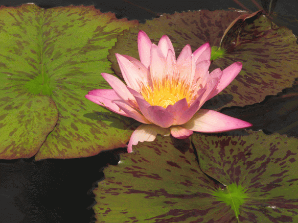
For my quilt I wanted to start with a photograph, and I found this one of a water lily that I took last summer at the Como Park Zoo & Conservatory in St. Paul, Minnesota.
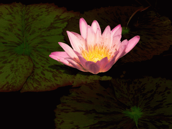
The contrast in the photo is pretty good, but I wanted to boost the contrast and also remove the three flower petals on the bottom. I made these changes in Photoshop, using the Clone Stamp Tool to get rid of the petals and adding layers to change the contrast.
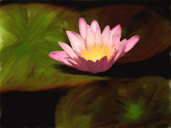
Next, I changed the image in Corel Painter to make it look less like a photograph. Below is the result.
With a bit of cropping to focus on the waterlily, I thought this would be a good image for my quilt. Using an Epson inkjet printer, I printed it on fabric that I’d coated with Golden’s Digital Grounds–the digital grounds allows for crisper prints on fabric. I’d used this before (see Marion and Charlie) with good results.
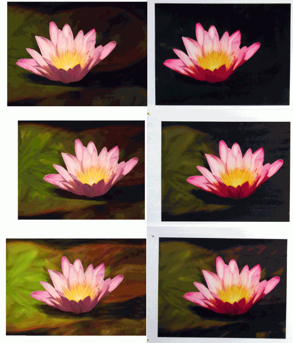
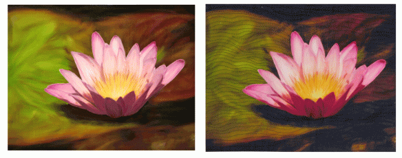
The first print on fabric came out much too dark — the background was basically all black. I lightened up the image and tried again — still to dark. So I lightened it again. Better, but still too dark. This is something I find frustrating and expensive when printing on fabric, since what I see on my computer monitor is not what I get on fabric. (And I have calibrated both my monitor and printer, but that’s a story for another day.)
Below is the comparison of these first three printing attempts. The image I saw on the computer is on the left and the printed fabric is on the right.
With a bit more lightening, here’s the last version. The image is on the left and the partially quilted fabric version is on the right.
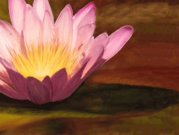
At this point, I decided I wanted to crop the image more and put the waterlily off-center. Since I was looking for lots of contrast and since the shadows are to the right of the flower, I wanted to crop out the left side of the image. Unfortunately there wasn’t enough room on the right side of the image, so I went back into Painter to extend the lily pads and shadows on the right. Below is the final image I used.
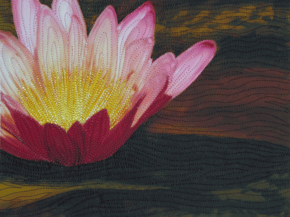
Here’s the finished quilt.
The water-lily starts and slides
Upon the level in little puffs of wind,
Tho’ anchor’d to the bottom.
Tennyson—The Princess. IV. L. 236.
It took me time to understand my waterlilies. I had planted them for the pleasure of it; I grew them without ever thinking of painting them.
Claude Monet

Jean
I am so much enjoying your process photographs and the explanation for how you make the decisions along the way. Although I sometimes take photos to help me remember placement or to try to fix a problem, I think your way of taking photos all the time to chart the developments is really helpful both to you and your readers.
Julia in NZ
Thanks for your nice comments Julia. Taking lots of photos as I work helps me with design decisions and is also a great reminder later on about how I did things.
Your final crop and extension of the lily pads looks terrific. I always assumed that, if that is the way the photo is, that is the way the quilt will be…obviously not. Great work!
Pingback: Maybe My Last Quilt for the Alzheimer’s Art Quilt Initiative | Color On Cloth