How to Create a Seamless Repeat in Photoshop Elements – Part 2

In part 1 I showed how to create a seamless repeat by editing the edges of a tile so that they line up properly when repeated.  There’s another useful way to disguise the edges, and that’s to add new images that go across the edges of the old tile.

1.  Here’s a simple example of this.  I’ll start with the tile below.

2.  Next is to”cut” the tile in half both horizontally and vertically and “paste” it back together.  This is done in Photoshop Elements using the Filter –>Other –> Offset command.  (See the previous post, step 3 for details of how to do this.)  Here’s the result.

3.  I could use the techniques from Part 1 of this tutorial to get the orange lines to meet at the edges so that the repeat would be seamless.  Alternatively, I could just cover up the orange lines with something that goes across the edges.  Here I drew a square to cover up the lines.

4.  Here’s what the two tiles look like in repeat.

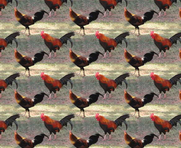
Both techniques — fixing the edges and covering the edges — can be use to create a richer repeat pattern.  I’ll show this with the rooster image I created in Part 1 of the tutorial.  Here’s the repeat pattern after the edges were fixed.  The repeat is seamless, but there’s a lot of ‘blank’ background in the pattern.  I’ll fill this in with rooster and hen images from other photos.

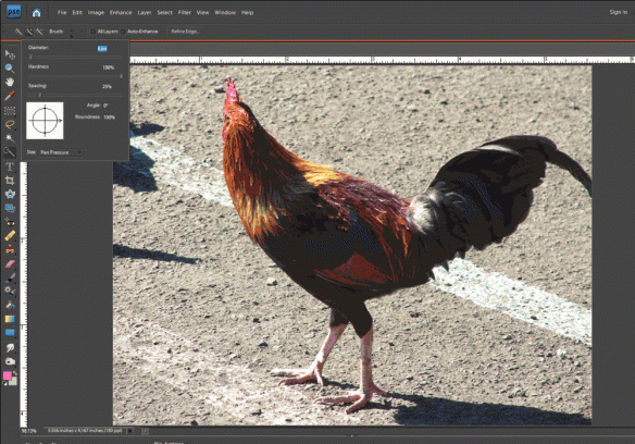
1.  Start by opening another photo with an image you want to add to the pattern.  Here’s a second rooster photo, and I’m going to use the Quick Selection Tool to select only the rooster and not the background.

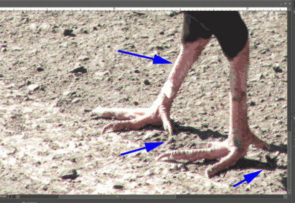
2.  After quickly selecting the rooster, here’s a screen shot where the dotted lines show the rough selection.  As highlighted by the purple arrows, there are some areas that need to be refined.

3.  Refine your selection until only the object you want to copy is selected.  The way to do this with the quick selection tool is to use the “Add to Selection”  and “Subtract from Selection” tools to nudge the selection line as needed (circled on the menu pictured to the right).  It can also be helpful to decrease the brush size when you’re trying to make fine adjustments to the selection.

4.  Once your selection is good, copy it to the clipboard using the Edit –>Copy menu command.

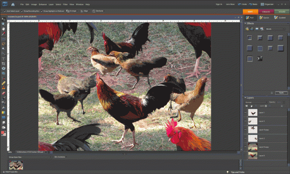
5.  Go to the file that has your original tile and use the Edit –>Paste command.  This will put your copied image into your file in its own layer, which is important so that you can move it around and change its size without changing the original tile.  Here’s a picture of the new rooster copied into the original image.

This would create the repeat pattern shown below.  Note how the second rooster image helps disguise the edges of the repeat tile.  (See Tutorial Part 1, step 6 for details of creating the repeat.)

6.  If you want to add more images, repeat steps 1 through 5.  Move the new images around to get an arrangement you like.  Here’s a version with 4 added images of roosters and hens.

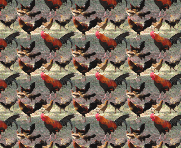
And here it is in repeat.  As Ludwig Mies van der Rohe said, sometimes less is more.

My First Entry in a Fabric Design Contest

Each week Spoonflower has a fabric design contest, using a different theme.  Anyone can submit designs and then people vote for their favorites.  It seems like a great way to get some exposure and be creative in the process.  So, this week, I entered for the first time.  The theme is Pointillism — creating a design using dots as some of the painters did in branching off from Impressionism.  The painting I remember from childhood is Seurat’s A Sunday on La Grande Jatte.

Here’s my entry Coneflowers.  You can see all the entries (and vote for your favorites) here.

One More Fabric Comparison

Someone reminded me today of another fabric “experiment” that I did–one that looked at the affect of sunlight on the fabric.  I again used the three samples — one an inkjet print on glossy photo paper, one a Spoonflower sample, and one printed on fabric using my Epson printer.  These are the samples before exposure to the sun.

I taped three swatches to a sunny south-facing window for 4 months.  Here are the results.  (Note that the Spoonflower swatch below is different from the swatch above, but the colors are very similar.  The other two swatches are the same ones in both photos.)

The Spoonflower fabric held up quite well to the sun exposure, but the ink jet prints faded significantly.

My Early Experiments with On-Demand Fabric Printing

I started making my own fabric designs in 2009, partly because I discovered a company (Spoonflower) that would take your digital image and print it on fabric.  Prior to that time, I’d done some printing on fabric using my own ink jet printer.  However, I never got results that I was satisfied with when printing on fabric.  I had color-calibrated my computer monitor, and when I printed on good quality ink-jet paper the results were fine, but I could never get that to translate to good colors on the fabric.  Combined with the potential for the inkjet prints to fade over time, and the high cost of ink, using the inkjet printer wasn’t a good option for me.

I decided to give one of the print-on-demand services a try.  I thought I’d make a quilt for my nephew using a few photos he’d taken – photos of dramatic clouds, a close-up shot of a rusty grill, and a photo of a leaf.

I made various kaleidoscopic images using Photoshop and a free plug-in (available here).  I then laid out all these kaleidoscopic images into one file that corresponded to one yard of fabric (i.e. 42 inches wide by 36 inches long).  I uploaded the file to Spoonflower and waited for my fabric.  It was really exciting when the fabric arrived—there’s something very cool about seeing a yard of your own fabric design.  I had rushed through the design part in my impatience to get the fabric, so not all the squares are the same size and not all are exactly square, but I loved the fabric and I was hooked.  This picture shows the yard of fabric, and you can view the resulting quilt here.

With all the fun I had making kaleidoscopes from photos, I designed another yard of fabric, this time with 132 different 2.5 inch square kaleidoscopes, made using flower photos I’d taken.  From this fabric, I’ve made a few small quilts for the Alzheimer’s Art Quilt Initiative, and you can see a couple of them here or here.  Following this, I designed another yard of fabric with kaleidoscopic images — this time based on photos of Chicago architecture I took while on a river cruise (you can see one of the Chicago quilts here), and then another yard using photos of a lake and lily pads.  I still have quite a few of these squares left 😉

For holiday gifts a year ago, I printed some photos on fabric, using Spoonflower, and made one small whole cloth quilt (here) and a couple small quilts where I fused the photo onto a larger piece of fabric (here and here).

This photo compares the same image printed 3 different ways — on the left is the image printed with an ink jet printer on glossy photo paper; in the middle is the Spoonflower fabric sample; on the right is the image printed with the ink jet printer onto fabric.  Each of these samples is 2.5 inches square.  Compared to the print on photo paper, the Spoonflower swatch has colors which are fairly true and the detail is quite crisp.  The swatch printed with the ink jet on fabric has colors which are quite washed out.  This comparison shows why I’m hooked on printing fabrics using Spoonflower.

Note:  while I only have experience with Spoonflower, there are other on-demand printing services, including Fabric On Demand, Karma Kraft and Eye Candey.