Most printed commercial fabrics today are made using some form of screen printing technique. This requires a separate screen for each color which will be printed. More colors mean more screens and higher manufacturing costs. To keep costs down, designs may be color reduced to use fewer colors in the final manufacturing set up.
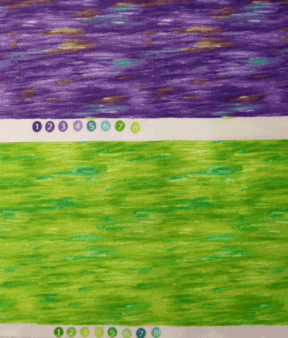
Printed commercial fabrics will often show the colors used in the printing process as numbered circles along the selvage of the fabric. Shown below are two colorways of the same design from Timeless Treasures. Each fabric was printed using the same screens, but 8 different colors, and the end results are different, with more contrast in the first fabric.

The design process for a commercial fabric might start with a hand-drawn or hand-painted design which is then scanned into a computer where the design and its repeat are finished. However, scanning an image is likely to result in thousands of colors–way too many for screen printing. A big part of the computer side of the design process is to reduce the number of colors to a manageable number–often less than a dozen–without sacrificing the quality of the original artwork. Once the “color reduction” is done, it’s a simple matter to change the colors to generate different colorways of the same design.
Digital printing technology allows anyone to print on fabric with virtually an unlimited number of colors. For many situations, there’s absolutely no need to color reduce a design before printing it with either your own inkjet printer or through one of the on-demand printing services (see here for some places to print your fabric).
Even though digital printers print with a huge range of colors, there are still some situations when color reducing a design is useful.
Color matching–When printing fabric on an inkjet printer, the colors you see on your computer screen are not always the colors you get on your fabric out of the printer. This can be frustrating and expensive.
A way to minimize this issue is to create your design using colors which you know how they will print on fabric. Most of the on-demand printing services offer color swatches and the corresponding digital file so you can see the printed color on fabric compared to the color on your computer screen–here’s an example of Spoonflower’s color guide. If you’re printing on your own inkjet, you can create and print your own color guide. When you use colors in your design from your color guide, you can be confident how the colors will print on fabric.
When you start your design with a photo or a scanned image, you might have colors in your design that you aren’t sure how they will look printed on fabric. Using Photoshop Elements (or other digital editing tools) you can replace colors in the design with known colors from your color guide. However a photo or scanned image might have thousands of colors, so to make color replacement manageable, the design first needs to be color reduced to a much smaller number of colors.
Colorways and color palettes—Two more reasons to color reduce a design are to create the design in different colorways or to create designs using a common color palette. I used these techniques in creating the designs for my Echinacea collection.
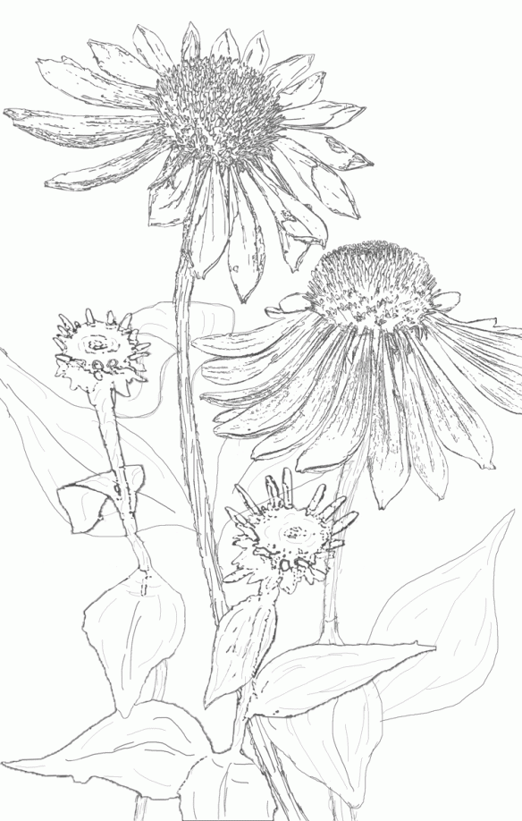
I started with the ‘focus fabric’ shown below. This design was color reduced to 64 colors.

Using Photoshop, I selected from the 64 colors in the design to create separate color palettes of blues, pinks and oranges. Then I replaced all the colors in the design with the blues to get the blue version of the coneflowers (below). Using this version of the design (now with about 10 colors rather than 64) I replaced the blues with pinks and then with oranges to get the different colorways.

I used the same color palettes to create the stripe fabrics to coordinate with the floral prints. You can see more fabric designs using these colors here.
In upcoming posts I’ll discuss how to use Photoshop Elements to color reduce a design. An example is below–the original photo is on the left, the color reduced design is in the middle, and a recolored version is on the right (zoom in to see the differences).

Dorothy: What kind of a horse is that? I’ve never seen a horse like that before!
Cabby: No, and never will again, I fancy! There’s only one of him, and he’s it. He’s the Horse of a Different Color you’ve heard tell about!
–from the Wizard of Oz
[looking for a certain type of flower] Blue flower, red thorns. Blue flower, red thorns. Blue flower, red thorns. Man, this would be so much easier if I wasn’t COLOR-BLIND!
–Donkey in Shrek


