Echinacea Fabric – Comparing Designs to Fabric

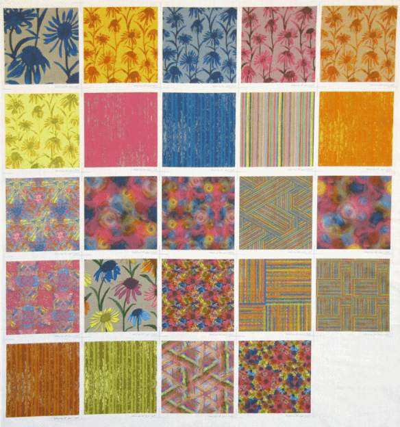
I just received the fabric swatches of each of the designs I made for the Echinacea collection–very exciting!  Up to this point, the designs only existed on my computer monitor, but now I have them in real fabric.  Here’s a photo of the fabric with the 24 swatches (it definitely looks better in person).

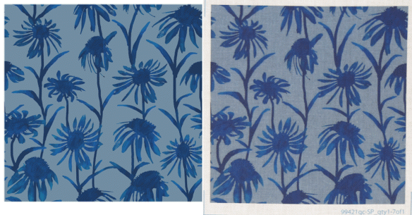
To get an idea of the difference between seeing the design on a computer monitor and the design printed on fabric, here’s a picture that includes the digital design on the left and a photo of the actual fabric on the right.  I tried to get the colors of the photo as close as possible to the actual fabric colors, but the fabric background is a bit bluer than this photo shows.  You can see all the digital designs on my fabric page.

After seeing the fabric, I made a few minor adjustments to some of the designs.  I’m not sure how the blue flowers in the upper left swatch got so gigantic, but I changed the size to an 8 inch by 8 inch repeat — the same repeat size as the other flowers.  I also changed the size of the multi-colored flowers (row 4, second from left) to also be 8 by 8 inches — this swatch shows it at 12 by 12 inches.  I modified the stripe colors in the pink, blue and orange striped fabrics in row 2.  In each of these samples I didn’t think there was quite enough contrast between the stripes.  I think this was mostly an issue of some of the colors being “out of gamut” for the printers that Spoonflower uses — basically the colors I saw on my computer monitor weren’t printed the same way by Spoonflower.  This photo below shows this issue with the orange stripe design.  On the left is the original design with an arrow pointing to some of the bright orange that was out of gamut.  In the middle is the fabric with the arrow pointing to the same part of the fabric, but the orange color is not as vibrant and the contrast between the stripes is too low.  On the right is the design with the corrected colors — the orange is a bit darker now and there’s more contrast.

Sunset Over Wisconsin Quilt

This weekend I wanted to try to make a more improvisational quilt than I’ve been doing lately.  I thought I’d try to use up a lot of the smaller pieces of fabric I had leftover from previous projects.

In particular, I wanted to use of some of the leftovers from A Walk with Sparky, shown here on my design wall.

I started cutting these up and sewing them together with some hand-dyed fabric scraps, just matching colors I liked.  I started arranging them into longer strips on my design wall, but I still wasn’t sure what to do with them.

Still without a real plan, I cut some of the pieces and started sewing them into stips of similar colors, light values at one end, progressing to darker values.  I was still envisioning this as a vertical arrangement.

When I finally turned the strips horizontally, I realized it looked like a sunset over the farm hills of Wisconsin.  I kept the quilting very simple–just echoing some of the curves.  Here’s the finished quilt.

Sunset Over Wisconsin

Winter Cardinal Quilt

I recently completed this small quilt–it’s about 9 inches by 12 inches.  It is a donation quilt for AAQI (as soon as I get around to sending it in).  We have a bird feeder right outside our kitchen window, and at this time of year, the cardinals that come to visit are one of the few bright spots in the yard.  Often we’ll see several male and female cardinals sitting in the pine tree, waiting for their turn at the feeder.

The quilt is made from a single piece of hand-dyed fabric with a piece of rust-dyed cotton/silk for the branch, and then lots of thread.

My Early Experiments with On-Demand Fabric Printing

I started making my own fabric designs in 2009, partly because I discovered a company (Spoonflower) that would take your digital image and print it on fabric.  Prior to that time, I’d done some printing on fabric using my own ink jet printer.  However, I never got results that I was satisfied with when printing on fabric.  I had color-calibrated my computer monitor, and when I printed on good quality ink-jet paper the results were fine, but I could never get that to translate to good colors on the fabric.  Combined with the potential for the inkjet prints to fade over time, and the high cost of ink, using the inkjet printer wasn’t a good option for me.

I decided to give one of the print-on-demand services a try.  I thought I’d make a quilt for my nephew using a few photos he’d taken – photos of dramatic clouds, a close-up shot of a rusty grill, and a photo of a leaf.

I made various kaleidoscopic images using Photoshop and a free plug-in (available here).  I then laid out all these kaleidoscopic images into one file that corresponded to one yard of fabric (i.e. 42 inches wide by 36 inches long).  I uploaded the file to Spoonflower and waited for my fabric.  It was really exciting when the fabric arrived—there’s something very cool about seeing a yard of your own fabric design.  I had rushed through the design part in my impatience to get the fabric, so not all the squares are the same size and not all are exactly square, but I loved the fabric and I was hooked.  This picture shows the yard of fabric, and you can view the resulting quilt here.

With all the fun I had making kaleidoscopes from photos, I designed another yard of fabric, this time with 132 different 2.5 inch square kaleidoscopes, made using flower photos I’d taken.  From this fabric, I’ve made a few small quilts for the Alzheimer’s Art Quilt Initiative, and you can see a couple of them here or here.  Following this, I designed another yard of fabric with kaleidoscopic images — this time based on photos of Chicago architecture I took while on a river cruise (you can see one of the Chicago quilts here), and then another yard using photos of a lake and lily pads.  I still have quite a few of these squares left 😉

For holiday gifts a year ago, I printed some photos on fabric, using Spoonflower, and made one small whole cloth quilt (here) and a couple small quilts where I fused the photo onto a larger piece of fabric (here and here).

This photo compares the same image printed 3 different ways — on the left is the image printed with an ink jet printer on glossy photo paper; in the middle is the Spoonflower fabric sample; on the right is the image printed with the ink jet printer onto fabric.  Each of these samples is 2.5 inches square.  Compared to the print on photo paper, the Spoonflower swatch has colors which are fairly true and the detail is quite crisp.  The swatch printed with the ink jet on fabric has colors which are quite washed out.  This comparison shows why I’m hooked on printing fabrics using Spoonflower.

Note:  while I only have experience with Spoonflower, there are other on-demand printing services, including Fabric On Demand, Karma Kraft and Eye Candey.

Snow Dyeing

Dyeing fabric using snow as a resist has become popular the last couple of winters, no doubt helped along by the crazy snows some areas are experiencing.  I’ve done it a couple times, but it doesn’t seem to work as well for me as it does for others.  I seem to get a lot of white areas in the fabric even though I’m using quite a bit of dye (at least it’s a lot of dye compared to the amount needed for low water immersion dyeing).  For complete directions on snow dyeing, the ProChem web site has a really good set of instructions (along with loads of other directions and safety information).

Here’s a look at my process in pictures.  First is the large under-bed-size plastic tub I used, with pieces of wire closet shelf material to keep the fabric out of the water as the snow melted.

I soaked the fabric in a soda ash solution for about 30 minutes and then I put the crumpled fabric in the plastic containers and let them sit out overnight.  By morning they were frozen with a bit of new snow on them.

I put on more snow (roughly 3-4 inches) and then squired on dyes.  The dyes I used were all pure colors of Procion MX dyes and I didn’t mix them before squirting on the snow.

I brought the tubs inside to let the snow melt.  The picture below is about 3 hours into the melting process.

The last four pictures are of some of the fabric.

There are some nice portions of the fabric that I’ll be able to use, but there is also a lot of white space.  I may end up over-dyeing most of these pieces.  In the end, doing this snow dyeing reinforces that low water immersion dyeing works better for my purposes, and, for me, LWI is actually easier and uses less dye.

A lot of people like snow.  I find it to be an unnecessary freezing of water.  ~Carl Reiner
There’s one good thing about snow, it makes your lawn look as nice as your neighbor’s.  ~Clyde Moore

Putting Color on Cloth

I love making art quilts and, for me, one of the most satisfying parts of the process is getting the right fabric for the quilt.  This usually means that I play a big role in the design of the fabric–putting the color on the cloth.

I’ve tried lots of techniques to get the right color on the cloth.  I’ve done a lot of low water immersion dyeing using Procion MX dyes, and as I’ve become more proficient at it, I can dye specific color gradations when I need them.  For a comprehensive site about hand dyeing, check out Paula Burch’s site.

I’ve also experimented with a number of other dyeing techniques.  Shibori dyeing is a fun way to add different patterns to dyed cloth (click here for some amazing examples).  Ironing a freezer paper stencil on fabric and then adding thickened dye allows you a fairly high degree of control over the end result, while deconstructed screen printing is anything but predictable.  

Gelatin monoprinting can also give some unexpected results, and despite its name, you can sometimes get multiple prints from one go.  Shaving cream marbling on fabric can be done using dyes, inks or paints. 

In addition to dyeing the fabric, there are other ways I like to add color to the cloth.  Paint is a good alternative to dye, though it can change the hand of the fabric, making it stiffer.  The simplest way is to just paint on the fabric using a textile paint.  Paintstiks (basically oil paint in crayon form) are another option.  Both methods usually require heat setting the fabric for the paint to be permanent.

A technique that I’ve used in a few of my quilts is rust dyeing.    This process can yield the typical rust color on fabric, but can also give a wonderful gray color when the rust is combined with tannic acid during the dyeing.  And of course, after the fabric is rusted there’s always the option of overdyeing it to put more color on the cloth.

I’ve even tried a bit of cyanotype printing (blueprints), though I have yet to use any of this fabric in a quilt.

Using a digital camera, computer and inkjet printer opens up tremendous possibilities for adding more color to the cloth.  I’ve made quilts by printing photographs on fabric and I’ve also designed fabrics on the computer which I printed through a commercial service called Spoonflower.

Once a quilt top is complete, there are still more options for adding color.  The quilting can be a major color component, and lately I’ve been using a lot of heavy weight polyester thread for quilting, sometimes will two threads at a time.  Beading is another good way to get in a bit more color.

My search for the best ways of putting color on cloth continues.  At this point, my favorites are the low water immersion dyeing, the fabrics designed on my computer, and the quilting.